In that tiny window, your outfit does a lot of talking. The trick? Use colour psychology so it speaks the message you want, not the one that gets you silently screened out.
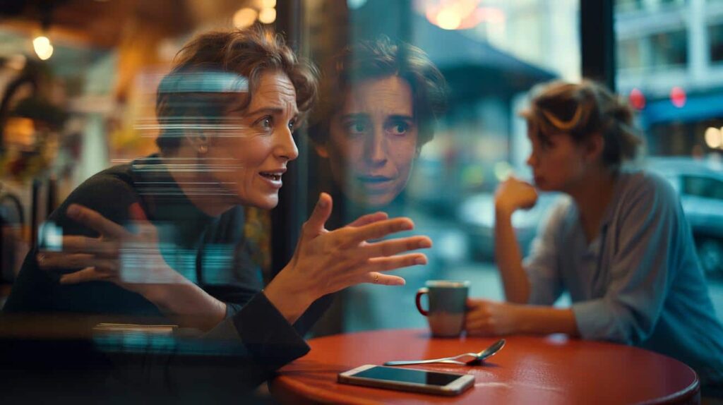
The lobby was too bright, and the air smelled faintly of coffee and printer toner. A candidate in a navy blazer rubbed their palms on their trousers, while another adjusted a scarlet tie that flashed like a warning light. The receptionist smiled the same neutral smile at everyone, but you could feel it: clothes were doing early reconnaissance before the CVs arrived.
I watched a woman in soft blue step forward; the hiring manager’s expression eased a notch. A guy in loud orange sneakers drew an eyebrow. Not a verdict, just an early bias, the gentle tilt of a scale. We’ve all had that moment when the room reads us in a glance and we can’t add context fast enough. The interview hadn’t started, yet everyone had already said something. Quietly.
It wasn’t about brands or price tags. It was colour. And colour is seldom neutral.
The quiet script colours write before you speak
Colour is emotional shorthand, and interviews are full of fast, emotional reads. Blue often signals trust and calm; navy, especially, whispers “competence” in corporate rooms. Black can project leadership or edge, depending on cut and company culture. Green leans balanced and steady. Red lights up urgency and dominance. White reads as clean and organised, while grey is measured and professional.
These aren’t fashion myths; they’re patterns hiring managers quietly report. A CareerBuilder survey of thousands of hiring pros ranked blue and black among the most “hire-ready,” while orange came out as the least professional. In a stack of maybes, small cues break the tie. You’re not being judged like a paint swatch, but your hues can tip the tone of that first exchange, especially when everything else looks similar on paper.
Here’s the logic. Interviews compress time and amplify heuristics. Colours are shortcuts the brain uses to filter risk and fit. When you walk in wearing navy with a crisp white shirt, many minds jump to reliable, composed, clear. A bold red dress might say confidence in sales, yet feel confrontational in compliance. Same person, different vibes. The psychology doesn’t lock you into a script. It just sets a default mood the conversation will either confirm or override.
The one-colour anchor trick
Use a single “anchor colour” to carry your message, then keep the rest neutral. Pick what you want to signal: trust (navy or cobalt), calm precision (steel grey), warm approachability (soft teal), creative intelligence (deep green or plum). Place the anchor near your face—tie, blouse, knit, scarf, pocket square—so it frames your expressions. Then ground it with two neutrals like charcoal, navy, ivory, or taupe.
Think of it as the 60–30–10 rule, adapted for interviews: 60% base neutral (jacket/trousers or dress), 30% supporting neutral (shirt or knit), 10% anchor colour near the face. That 10% does the talking; everything else nods. Let’s be honest: nobody really does that every day. On interview day, it’s a simple way to look pulled together without shouting. Keep the anchor saturated but not neon. Soft, rich, camera-friendly.
Common slip-ups? Too many loud colours fighting at once. Wearing red when you mean rapport, or pale beige that blends into the wall under office lighting. Matching the company brand palette exactly—fun for a career fair, odd in a finance boardroom. If you’re unsure, photograph the outfit in daylight and under warm indoor light. Then do one last Zoom check. On camera, colours skew; navy can look black, crisp white can bloom. If your outfit supports your voice rather than competing with it, you’ll feel it in your shoulders.
“Pick the vibe you want your first 30 seconds to deliver, then let one colour do that job,” says Lydia Rao, an executive stylist who coaches candidates across tech and finance.
- Finance or law: Navy suit, white or ice-blue shirt, steel-grey tie or scarf.
- Tech product or data: Charcoal jacket, soft white knit, cobalt or deep green accent.
- Creative or media: Stone or camel base, ink shirt, forest green or plum accent.
- Healthcare or education: Soft blue or teal anchor with light neutrals.
- Sales or partnerships: Navy base with a warm red or raspberry accent—controlled energy.
Make colour your ally, not a costume
Here’s a human test: put on your outfit, then read a tricky interview answer aloud. If your words feel smoother and you stop tugging at your sleeves, keep it. If you feel “in costume,” scale back the saturation and bring the anchor closer to your face. A navy sweater under a blazer can do more than a shouty tie. Your comfort is half the psychology; nerves amplify whatever you wear.
Fit the hue to the room. Corporate roles tend to reward navy, grey, and a cool blue accent. Start-ups tolerate more texture and soft colour—sage, slate, muted plum—without losing polish. Customer-facing jobs can handle warmer notes: a restrained red, a rosy beige, a terracotta belt. Avoid neon, busy prints near the face, and anything so black it swallows detail on camera. One punchy detail beats five small distractions.
Culture counts too. In some regions, white is formal and crisp; elsewhere it can signify mourning. If in doubt, go for adaptable classics: navy, mid-grey, and blue-based accents. Skin undertones matter less than people think, but if a colour makes you look tired, move it away from the face. **Blue builds trust.** **Green calms nerves.** **Red raises the temperature.** Choose the thermostat that suits the conversation.
There’s also a quiet piece no guide can decide for you: your story. Maybe you wear a cobalt blouse because the last time you wore it, you pitched an idea that changed a team. Maybe a deep green tie reminds you to breathe. These cues are invisible to the panel, but visible to you. Colours can be anchors for attention, not just signals to others.
One more real-life trick: the grayscale screenshot. Snap a photo of your outfit and convert it to black and white. Do your face and eyes remain the focal point? If a big dark block draws all the attention, swap that piece for a softer tone. Interviews are about your face—your micro-expressions, your listening, your pauses. Let the colours support the frame.
If all this sounds like effort, remember the payoff: less cognitive load when the first question lands. You won’t be fussing with a loud print or worrying if your jacket reads “too much.” You’ll be present. And being present is the most hireable look in any room.
Many people ask about patterns. Simple, close patterns—pinstripes, fine houndstooth, micro-checks—can read as texture from a distance. Large contrast patterns can vibrate on camera and distract in small rooms. If you love prints, keep them subtle near the face and let your anchor colour do the personality work.
Accessories? Low-glare, purposeful, small. A single coloured piece—a scarf knot, a pocket square fold, a clean watch strap—can be the 10% anchor. Shoes sit in the periphery of attention, yet they finish the story. Polished, quiet, in the same temperature as your outfit (cool or warm). No one gets the job for their shoes, but people notice when the story breaks at ankle height.
Interview day is a lot. Your outfit shouldn’t add to the noise. Pick one colour message. Place it near your face. Ground it in neutrals. Speak, breathe, listen. The panel is reading you, yes. You get to write some of that script.
Your own calibration matters. A creative strategist in plum might look fully aligned in a media studio and out of place in a bank tower. A compliance analyst in navy with an ice-blue knit can look at home in any boardroom. Think job, company, and room—then hue. If you’re between choices, choose the calmer colour and let your words bring the spark.
There’s a reason navy shows up in so many “best for interviews” lists: it’s the background that lets your face carry the plot. Grey does the same, with a slightly more analytical edge. White and ivory sharpen lines in person, but on camera you may prefer soft white to avoid glare. Small tweaks, big difference.
And if you’re tempted to mirror the company’s brand colour, keep it subtle. A cobalt accent at a fintech known for blue? Smart. A head-to-toe orange look for a retailer with bold orange branding? Risky. Wear alignment, not a billboard.
There’s a lot of talk about authenticity right now. Good—because the best outfits don’t fake anything. They translate. Colours give your intentions a visible shape, the way a good slide deck frames a story without shouting over it. The right navy can make your calm read as competence, not silence. The right green can make your curiosity feel grounded, not flighty. The right red, in the right sliver, can turn a pitch into a moment people remember.
One last thing the mirror can’t tell you: how you sound in your colours. Record a 30-second answer wearing your chosen palette, then another in a different one. Many people are shocked at how much smoother they feel in “their” hues. It’s not magic. It’s less friction between how you want to be seen and what you broadcast at first glance.
Your clothes won’t win the interview for you. They will unclutter the path. Pick your anchor. Put it where it frames your face. Let the neutrals hold the line. Then go tell the story only you can tell.
| Point clé | Détail | Intérêt pour le lecteur |
|---|---|---|
| Use a single anchor colour | Place 10% of a strategic hue near the face; keep the rest neutral | Instant, low-effort way to send the right signal |
| Match message to role | Navy/grey for trust and precision; green for balance; controlled red for energy | Aligns first impression with job expectations |
| Test in real conditions | Daylight vs indoor, Zoom check, grayscale screenshot | Prevents surprises and keeps focus on your face |
FAQ :
- What colour works for most interviews?Navy with a soft white or light blue near the face. It reads as competent, calm, and adaptable across industries.
- Is black a good idea?In moderation. Black can look sharp for leadership roles, but head-to-toe black may feel severe or lose detail on camera.
- Can I wear red?Yes, as an accent—tie, lip, pocket square—when you want controlled energy. Avoid big blocks of red in risk-averse settings.
- How about patterns?Keep them small and low-contrast near the face. Let texture do the work instead of bold prints that pull focus.
- What if I’m colour-blind?Use texture and contrast as your guide: navy or charcoal base, soft white shirt, one accent that’s confirmed by a friend or a store associate.